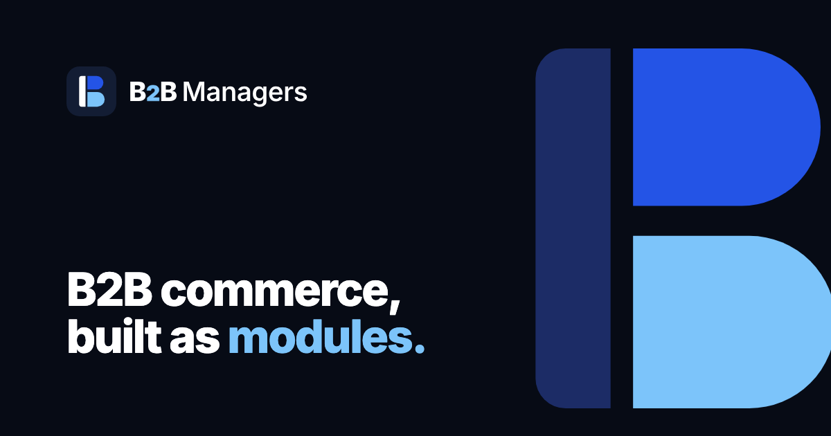
Our logo
One letter, built the way we build software.
The B2B Managers mark is a capital B made from three separate pieces: a backbone and two modules plugged into it. It is a picture of what we sell.

Three parts, one idea
-
The backbone
The tall bar is the store itself: WooCommerce, your catalog and your checkout. Everything we make plugs into it and none of it replaces it.
-
The modules
The two rounded shapes are B2B features: role pricing, quotes, trade accounts, order rules. Each of our extensions does one job, and a store adds only the jobs it needs.
-
The gaps
The thin spaces between the pieces are deliberate. They say the modules are separate and can be swapped, which is the opposite of one heavy all-in-one plugin.
Why two modules?
Two businesses joined through one shared backbone is business to business. So the mark spells out what we do as well as the first letter of our name.
In the wordmark the 2 is set in royal blue, or sky blue on dark backgrounds. It is the "to" in business to business, and the one character we let stand out.

What the colours mean
Three colours carry the brand. Sky blue is used sparingly so it always means something.
#0F172AReliability. The steady base wholesale buyers trust with their orders.
#2454E6Trust and clarity. Our buttons, links and the top module.
#7CC4FAGrowth. A highlighted price, a free badge, the bottom module.
Watch it assemble
In motion the logo tells the story in order: the store comes first, then each module plugs in, then the name arrives.


A name of our own
We used to be WooManagers. We renamed so our brand stands on its own: our extensions still work with WooCommerce, and say so in their names, but the company name, the logo and the colours are ours alone.
B2B Managers says who we build for. The mark says how we build.
Browse the modulesLogo files
For press and partners. Please keep the logo unaltered and give it room to breathe.